Posts Tagged ‘agency website’

(Webinar) So many agencies. So little difference.

Is your agency truly unique?  Or are you one of the thousands of agencies selling the same products and services? Almost all agencies claim to be unique, different or better while using essentially the same descriptors as the others. The truth is, most prospects (advertisers) can barely tell the difference in your agency and your biggest competitor.

In this session we looked to fix that by discussing:

  • Your differentiator isn’t different at all
  • How to find your difference
  • Using your differentiator to generate more opportunities

For any business development program to be successful, we need to take this first step of identifying a truly unique position.  Once that positioning is in place content and distribution becomes much more effective.  Hopefully this webinar will give you a great first step in finding your uniqueness!

Our guest host this month was John Heenan.  Be sure to check out his website for other great insights and content!

So many agencies. So little difference. from Catapult New Business on Vimeo.

Continue Reading

Building a new agency website? Don’t stop your Business Development!

Websites are revenue generators; in fact, I’ve written about it before.  If you’re like most agencies, you want to represent your business in the best light which often means refreshing your website once a year, or possibly create an entirely new one.  When undergoing changes it’s critical to not sacrifice your business development efforts.

Often times I hear from clients that they’d prefer to put their prospecting on hold until their website is just the way they like it. Their fear is: I talk to a prospect, they visit my site, they don’t like our old site, and we have now burned that prospect forever. Because of that fear, outreach efforts are put on hold, and new business takes a back seat to web design.  If it’s like most website redesigns, timelines get dragged out and that one month projection somehow turns into three.

Don’t fall into this trap. A four-month hiatus is something your new business outreach can’t afford. Business development is a process that should happen consistently throughout the year, regardless of your website redesign. There are options however to keep your new business machine up and running through situations like this.

Play to your strengths, and drive conversations to those areas with these workarounds:


Landing Pages
– I find these are grossly underused in the agency new business world, which is crazy.  They are the easiest way to create specific content attached to your site that is directly relatable to your new business conversation.  Need a page highlighting a particular service, vertical, or expertise?  Create a single new page and link to that while your new site is being build.  This allows you to drive people to something relevant and there is less distraction to some of the weaker parts of your site.

Hosted content – Every good marketing automation platform at this point has the ability to host media content.  That means we can utilize the hosted media links to not only send people to a safe space for content, but we can track every one of those clicks and reads in order to follow up with them at the right time.  For those of you trying to avoid your website completely, there is the added benefit that it is entirely away from your site.
Trying to perfect the imperfect can be a long, daunting task.  Losing sight of your new business goals while obsessing over a website redesign can put you behind your revenue goals by 4-6 months in the blink of an eye.  So if you are starting that site redesign, I’d encourage you to build a few new landing pages, get yourself a few pieces of content hosted, and keep selling!

Continue Reading

Your Agency Website is a Revenue Tool, Not an Experiment for Creative

There’s a saying around our office that if you look at a company’s website, and you can’t tell what they do, they are probably an agency.  That ambiguity might be considered cheeky when the visitor knows who your agency is, but it spells certain doom for any agency looking to generate new business and leads through their website with prospects that are visiting them for the first time.  While your website can be a fun, creative playground for your team, we need to remember that the primary goal of any good website is to convert prospects into new revenue.

The fact is 39% of people will stop engaging with a website if images won’t load or take too long to load.  (Source: Adobe).  What does this mean for your design?  It means that we need to be conscious of where our visitors come from, what devices they are using to research you, and make sure that while your site is attractive, that attractiveness does not take away from the experience of finding out just what you do.  For creatives (non-sales people) I understand the push back here.  Nobody wants a plain or salesy feeling agency website, but we do want to be sure that it is a revenue generator, not a confusion generator.

The most successful agencies I’ve seen all have their past creative prioritized on their site, but it’s important to remember – it’s not the website itself that is the creative showcase.  This is an important distinction, because when a prospect is visiting your website, they want to know:

A) Can you solve my problem?  (clear and unique agency positioning on all pages)

In the case below, the positioning is very clearly and cuts directly to the problem they solve for their clients.  Within 3 seconds, we know exactly who they are and what they do that is unique. 

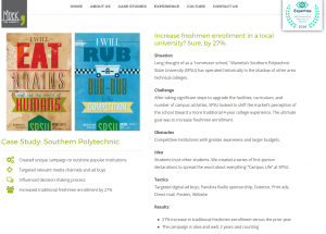
B) Have you done it previously? (clear view of past creative and case studies)

Love this use of Case Studies – short and clear problem, solution, results.  This is a great CTA target for any outgoing communication.
C) How do we get in contact? (contact page for key agency decision makers)

Multiple places to take action on this homepage, giving prospects a place to convert from anywhere on their site.  They do a nice job of consistent positioning as well, along with vocalizing that immediately.
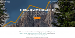
If we can simplify this online journey for our prospects, then we can greatly increase our chance of converting them from an anonymous visitor to a lead conversation.  I would encourage you to sit down and go through this journey yourself with your current website.  If you can’t find a truly unique positioning statement on each page, we need to edit.  If you are not led quickly to outstanding results and work, then we need to edit.  If you have to click a few times to find someone to contact, we need to edit.

This isn’t meant to say that your site should be boring and plain, or that you should just have random “contact us” buttons on every page like you are pushing a free trial.  Be creative, show off your digital chops, but just be thoughtful in where and how you do that.  If they have to sit through a five minute video, or go through an interactive hide and seek on the home page to find your agency’s past work, they will probably run rather than seek.

Continue Reading